User Story Mapping and FeatureMap
User story mapping can allow your team to see and understand the product from a user-centric design. You can see the bigger picture of the product, help the team identify gaps and dependencies, and give the first framework of a shared understanding between your entire team.
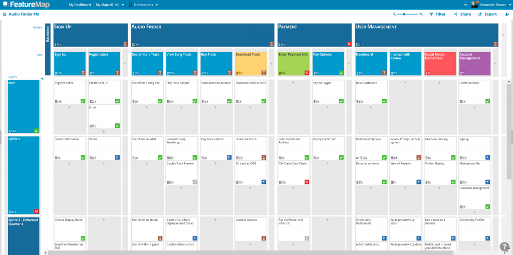
A finished FeatureMap Board should have your entire product outlined. The team will have sections separated, and you’ll be scheduling and planning the outline of prioritized stories into sprints and releases.
In this article, we will share how to gain a better shared understanding of a map by utilising the feature of aggregation.
In short, it is the option of aggregating values. On each card you can assign a status, estimation and a budget. When you assign the aggregation option to a header card, the card will gather the values of all sub cards and calculate, dynamically, the overall status or number.
A beautiful map, full of information, which can be daunting, but with ease you can see if the product development has any issues just by looking at the aggregated dynamic values on each of the layer headers.
Let’s break it down.
Status Aggregation
With Status, you are able to assign to a card, displaying a coloured icon on the main map. Great for that easy acquisition when viewing the larger map.
The statuses you can apply are: Todo, Ongoing, Done, Cancelled, Blocked.
With aggregation, you can apply the option “automatic (aggregated)” on your header cards, and the header card will a value by priority to display allowing the team to see each header, and associated higher task status.
A quick glance at a busy map can be even quicker with good application of status icons, and aggregation allowing you to identify issues and solve them quickly. This is one huge advantage for those busy product owners or leads ?
The priority for aggregation display is by importance: Blocked -> Ongoing -> Done.
When a card is set to “To-Do” and “Ongoing” are is aggregated as “Ongoing”.
- When a column or layer has a “Blocked” card, this takes priority and is aggregated as “Blocked” as to draw attention to issues.
- When all cards within a column/layer are done, the aggregated value draws “Done”.
- The status “Cancelled” is ignored.
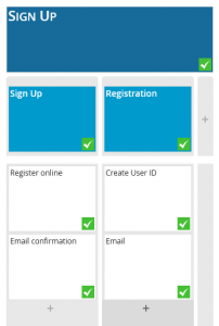
The header card (groups) Sign Up has been set to an automatic (aggregated) value.
The sub headers (lists), Sign Up and Registration are also set to automatic (aggregated).
The cards in those columns have all be seen set with “Done” status.
The value will dynamically be displayed based on the values of the cards within the sub-cards.
In this case, FeatureMap draws the values from Register Online and Email Confirmation.
Both are “Done”, so the value aggregated is “Done.”
Budget and Estimation Aggregation
The task status is not the only aggregation option. You can also track your assigned values of budget and estimation.
When you assign numbers to a card, and then aggregation to the header. It will draw vertically to each header group and list or, if applied to a layer header, it will draw horizontally to each layer. This allows you to see the overall bigger picture, but also a specific collection of times, costs or the main status of the project.
In this FeatureMap we are utilising Aggregation.
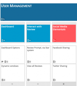
On the User Management Section, we are not aggregating status instead we are estimating the time it will take for our developers to code the described section.
You can see the Dashboard Options Card is estimated to take 15 hours, and the Dynamic Windows Card is estimated to take 20 hours.
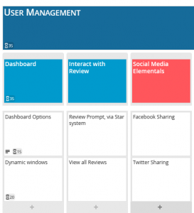
The header above – Dashboard draws those numbers and calculates both, giving us 35 hours. At a quick glance, the team now know the Dashboard feature should be done after 35 hours.
This aggregates higher to the USER MANAGEMENT header as well, showing us the value of 76 as it draws all estimations in it’s sub lists of Dashboard, Interact with Review and Social Media Elementals.
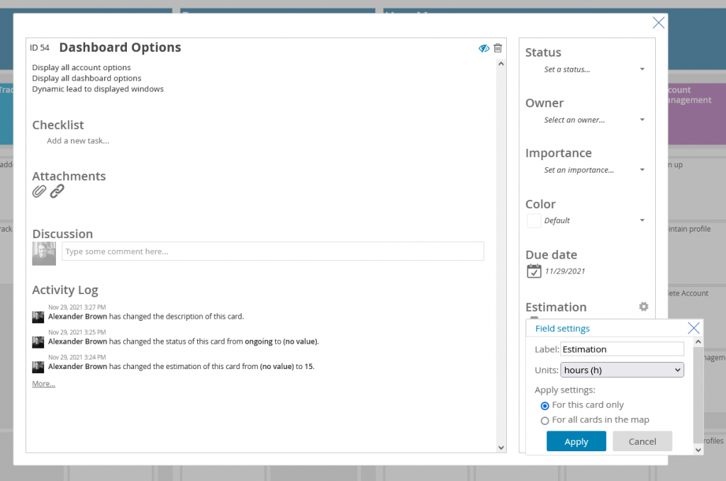
Customising the Aggregation Options.
On both Estimation and Budget, you can rename the labels of these fields and assign units.
If you decide to do this after the fact, worry not, you can assign the field settings to a single card, or all cards on the map when editing the options.
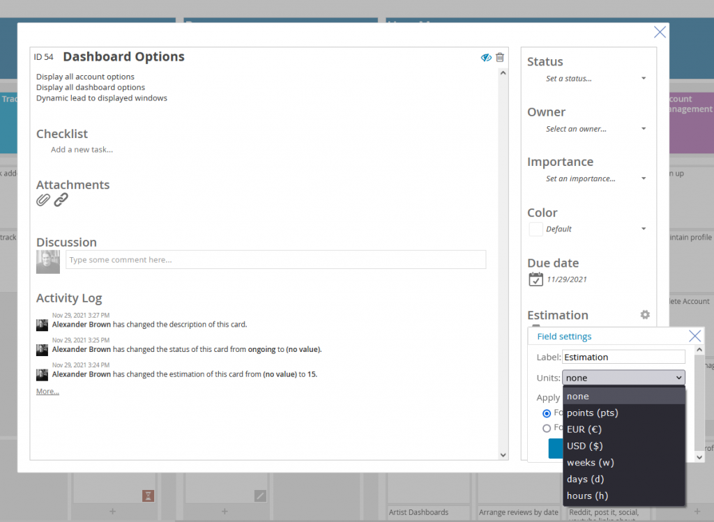
To edit, open up a card and click the grey cog wheel next to the Estimation or Budget field.
Here you can rename the fields, and assign units.
Units available are:
- none (default)
- points (pts)
- EUR (€)
- USD ($)
- weeks (w)
- days (d)
- hours (h)
Apply to all cards please, and let my map be beautifully informative.
Vertical or Horizontal
Aggregation can be applied horizontally or vertically.
When you apply it to the Group and List Headers (Vertically) the aggregation will be drawn from the entire column, spanning every sprint or value.
As such, it is much more common to see the aggregation applied horizontally to see the Sprint status.

Aggregation Helps
A user story map need not be static. Teams can update it with findings from research spikes, revised estimations, and user feedback from sprints and releases. The story map can also be used as a visual roadmap to communicate both the planned work and the work that remains.
So if you find yourself as a product owner or project manager wondering the status of your developers, and you want to avoid it interrupting them distracting them or holding unnecessary meetings, the aggregation tool is invaluable for your management.
It allows your developers to keep you updated while allowing an optimal level of communication. Maybe they’ll get more done? ?

Give aggregation a go, you’ll be surprised how much control it gives to your map. You can access aggregation options with a Premium Subscription, or with the free sign-up trial.
Happy Mapping!